Hillarys
CASE STUDY
Seven years leading design for the Hillarys product team at Code Computerlove. I shape customer experiences that balance user needs with commercial goals, building trust through insight, leading research and testing, and running workshops that turn into real design outcomes.
ROLE
Design Lead
TIMEFRAME
2019 - 2025
WORKED WITH
Client, product managers and engineers
FOCUS
CRO, research and design systems
Case study highlight #1
Homepage redesign

THE PROBLEM
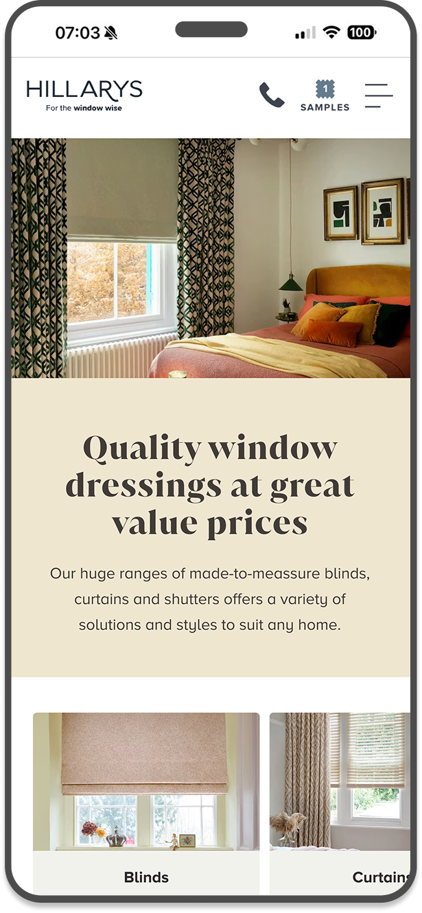
Over time the Hillarys homepage had become a battleground for competing departmental priorities. Multiple teams had added their own content and requirements, leaving the page cluttered and without clear strategic direction. Getting stakeholder buy-in for change was proving difficult — everyone had a stake and no one wanted to give ground.
THE APPROACH
Rather than arguing opinion against opinion I ran a preference test comparing the existing page against a streamlined concept, using objective user data to cut through the noise and make the case for a more focused approach. The redesign reclaimed the homepage as a clear customer entry point, simplifying the messaging and surfacing the unique Hillarys service proposition.
+8.2%
OVERALL CONVERSION RATE
RESULTS
+6.9%
SAMPLE CONVERSION RATE
-3.1%
EXIT RATE REDUCTION
THE LEARNING
Data is the most powerful tool for stakeholder alignment. When you can show a business what its customers actually prefer, opinion stops being the loudest voice in the room.
Case study highlight #2
Shutters Journey redesign
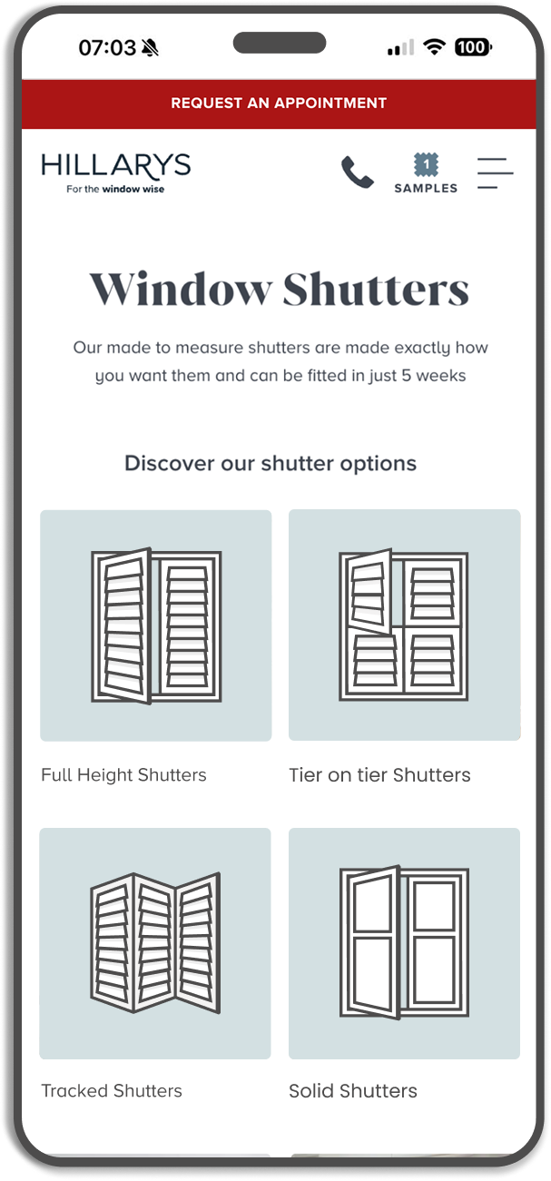
THE CHALLENGE
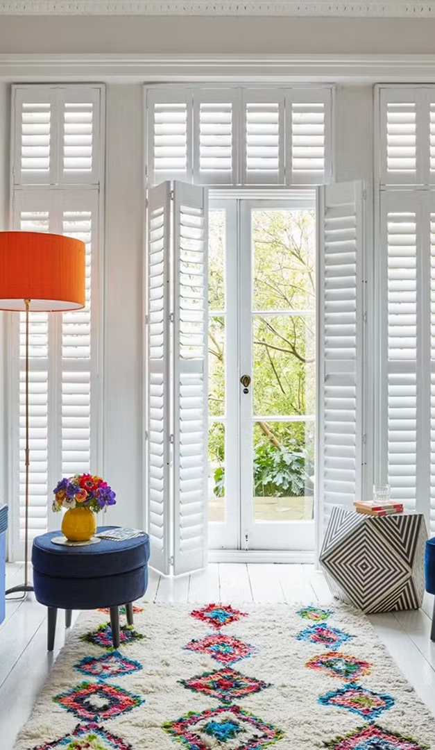
Despite being a key product, the Shutters onsite journey had been overlooked for years. The experience was confusing, the content hierarchy was unclear, and it was significantly underperforming its commercial potential.
DISCOVERY AND STRATEGY
A six-month intensive project using Day Zero workshops, moderated user testing, and iterative onsite experimentation. Rather than redesigning in one go we tested and refined throughout. The redesign introduced a new landing page to segment users by shutter type immediately, custom iconography to explain complex product differences, a stronger value proposition, and a stripped-back PDP focused on essential information.
THE RESULTS
The optimization had a massive impact on both user behavior and the bottom line:
+12.4%
USER TO LEAD CONVERSION
THE LEARNING
Complex product categories need design that does the hard work of explanation, so the user doesn't have to. Iconography and clear hierarchy can replace walls of text and dramatically improve understanding.
The research behind the work
RESEARCH
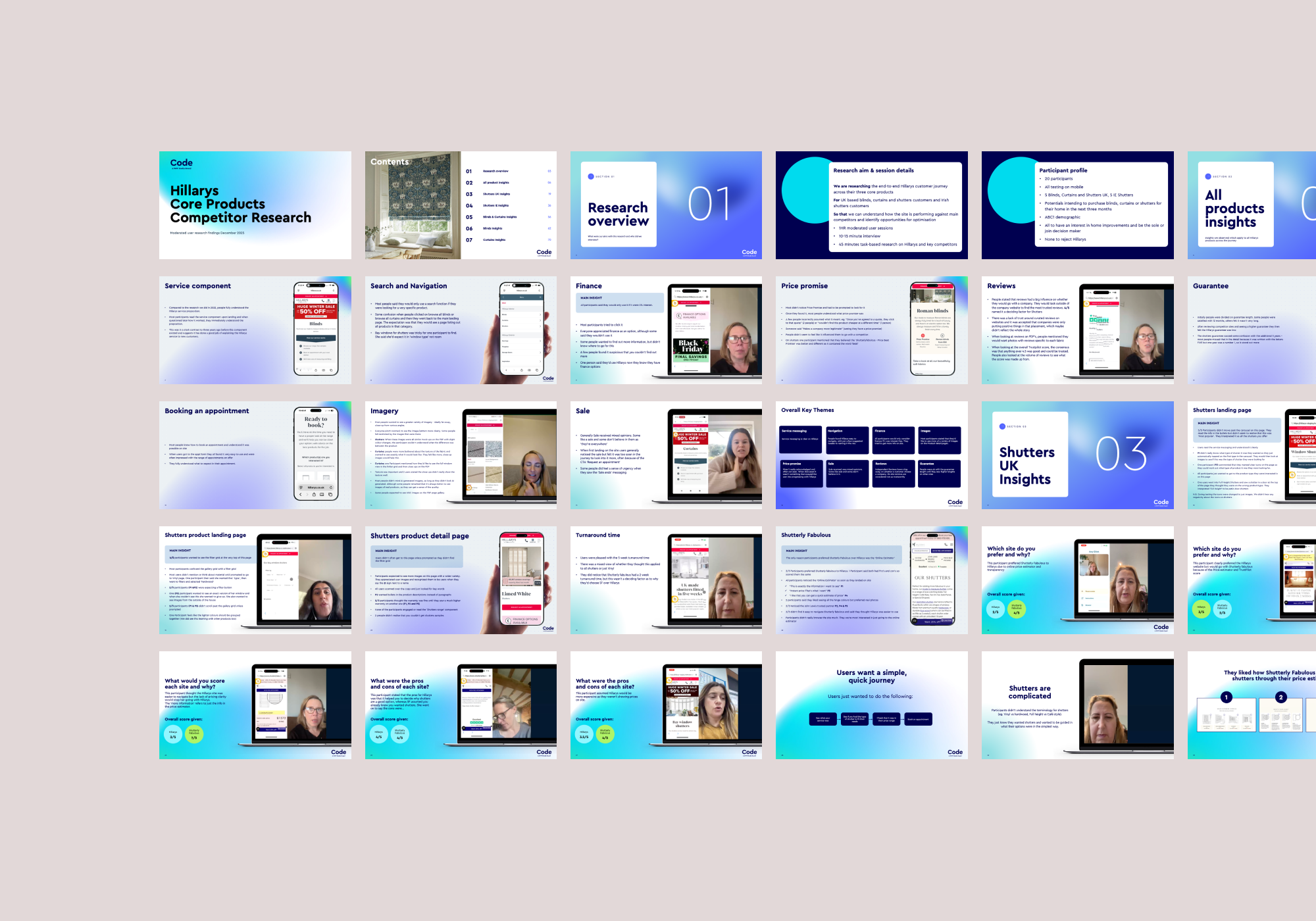
Research Analysis
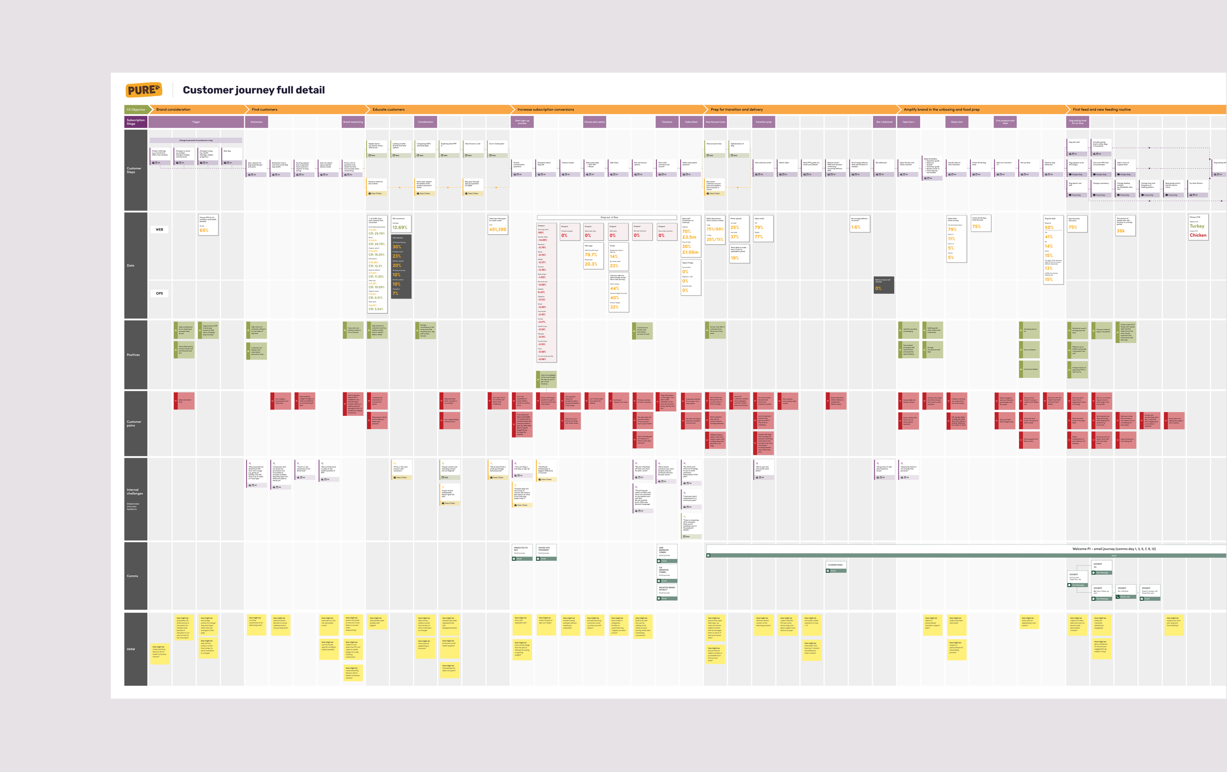
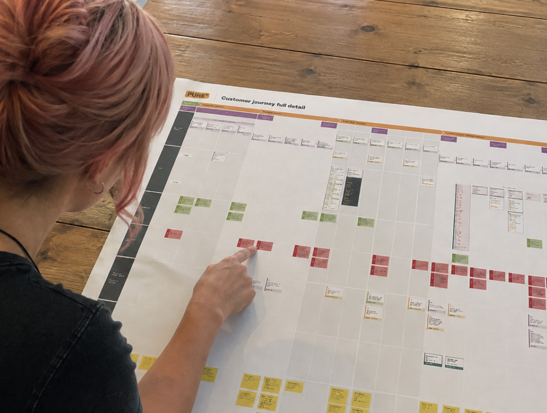
Customer Journey Map

“I’ve worked with Gina for 5 years; her UX expertise and use of data are a huge asset. She consistently delivers the right user journey while balancing commercial and SEO requirements. As a result, we’ve seen the site’s conversion rate increase year-over-year, even in a tough trading environment.”
Lucie Turnbull
Digital Brand Manager Hillarys
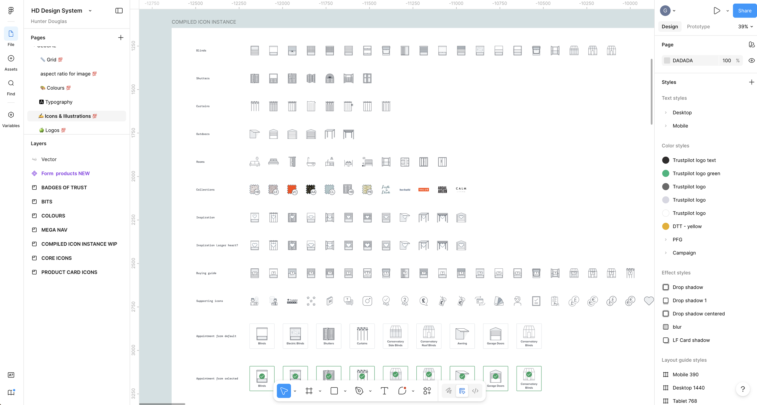
BEHIND THE SCENES
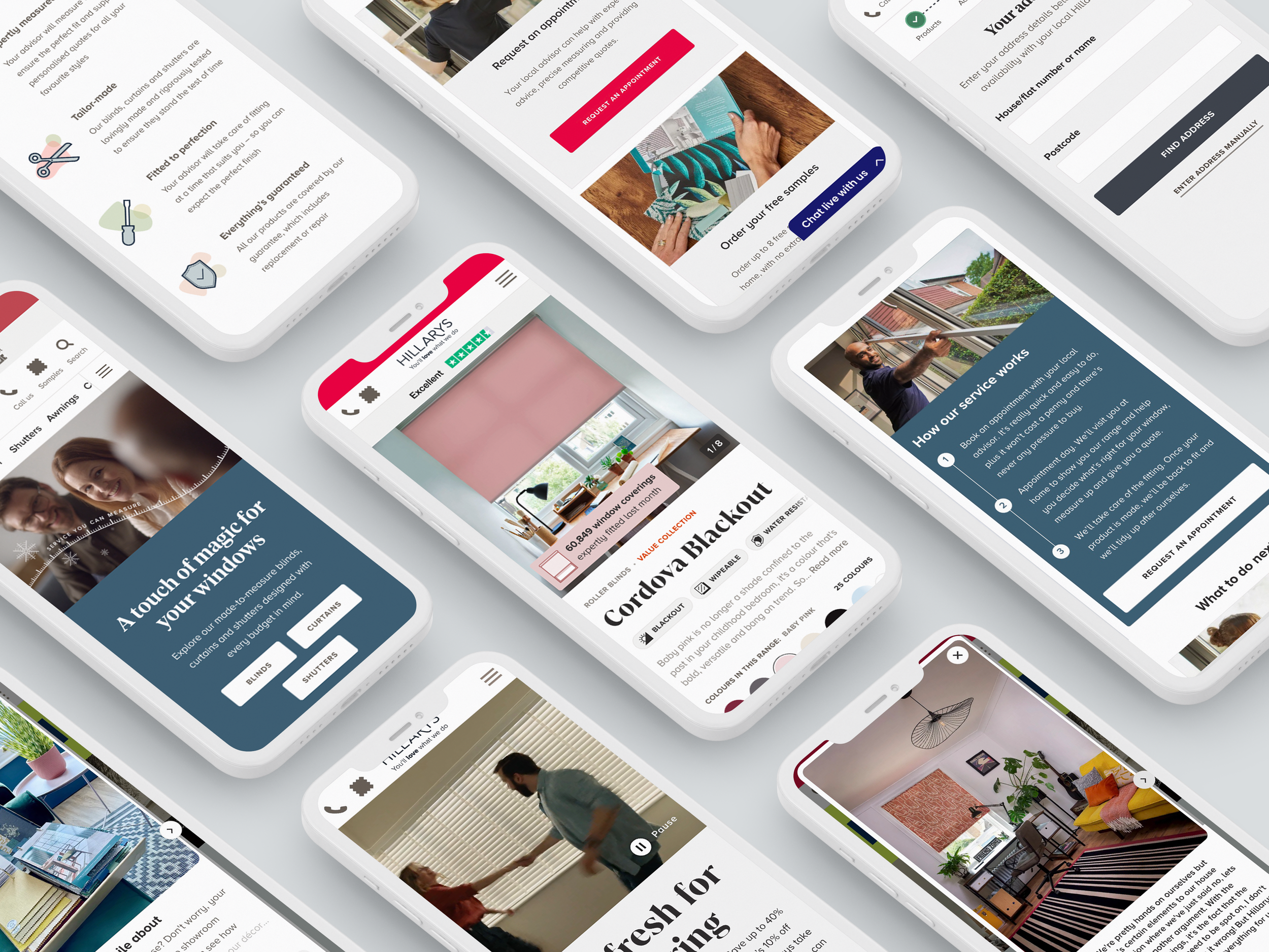
A design system for 40+ brands
Following Hillarys' acquisition by Hunter Douglas, a global group of 40+ brands, I led the design systems work to move the site onto a modern, scalable platform. The challenge was building a component library flexible enough to serve very different brands while keeping quality and consistency across all of them. I defined the component architecture and used design tokens so new brands could be onboarded quickly.